Charts & Comparisons
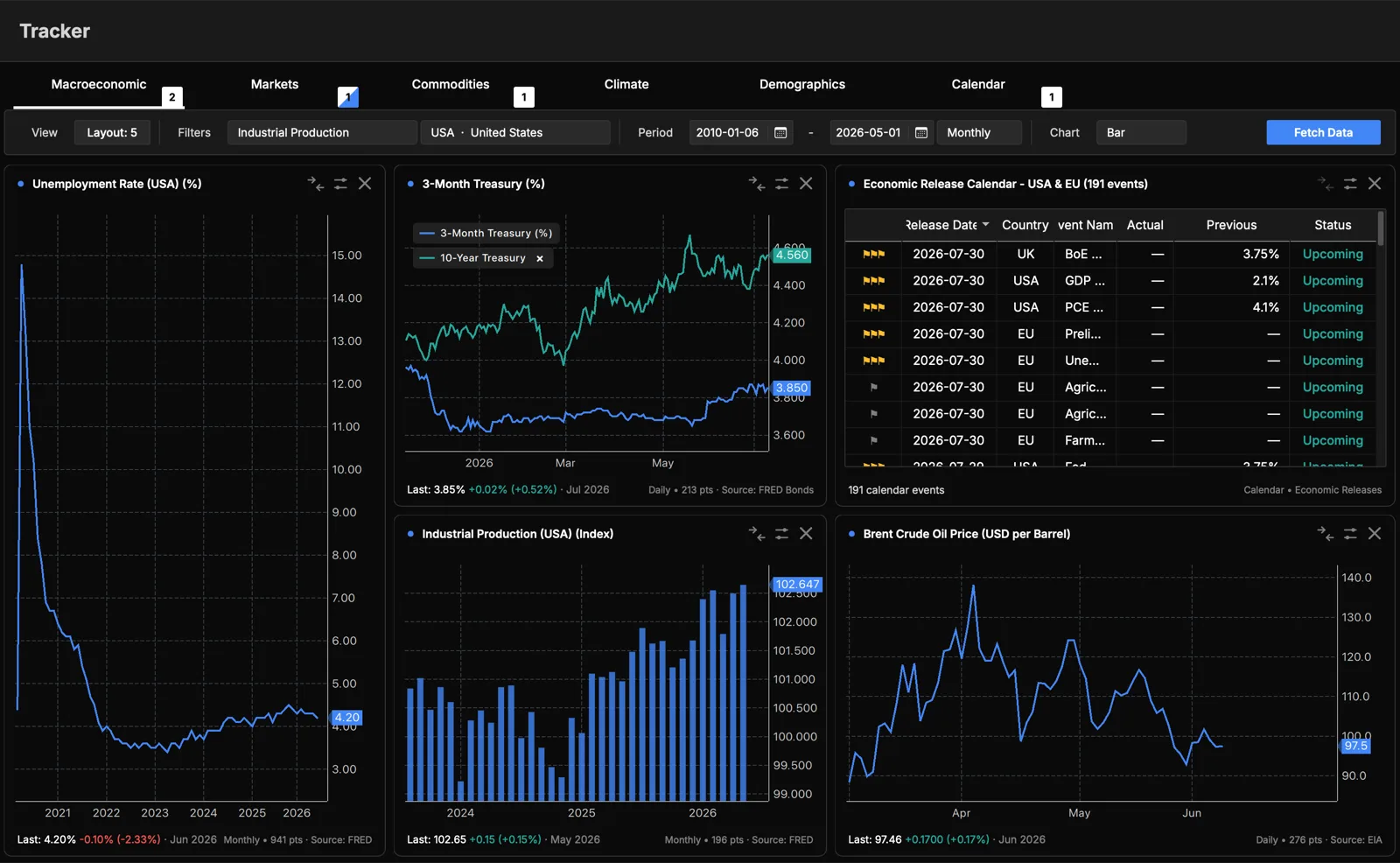
Layouts
Use the layout control to show one chart or split the workspace into 2, 3, or 4 frames. In a multi-frame layout, click a frame to select it. Its settings then appear in the control bar, and you can add or remove frames.
Each family remembers its last indicator, country, period, chart type, and any overlays, so switching back restores your view.
Chart types
- Line: one or more series as continuous lines.
- Area: a filled version of the line.
- Bar: values as bars per period.
- Seasonal: one line per calendar year on a shared January to December axis, so you can compare the same months across years.
- Map 2D / Map 3D: for climate indicators with spatial data, a flat heatmap or a rotatable 3D globe for a chosen month.
Comparing series (overlays)
Click the compare button on a frame to add another series on top of the current one:
- With compare mode on, browse to another indicator or country.
- Click Fetch Data to overlay it.
- Repeat to add up to four overlays (five series total). Each gets its own color and a legend entry you can remove.
Axis handling (in the frame's menu) controls how overlaid series share scale:
- Auto: series share an axis when their units match, and are normalized otherwise.
- Shared axis: all series on the same scale.
- Split axes: each overlay gets its own axis.
- Normalized (%): rebase every series to 100 at its start to compare shape and relative change.
Export & styling
From the frame's menu you can:
- Export the chart as PNG or PDF, or export the data to Excel.
- Change the color of a series with the color picker.
The footer of each frame shows the latest value, its change, the number of data points, and the data source.