Tracker
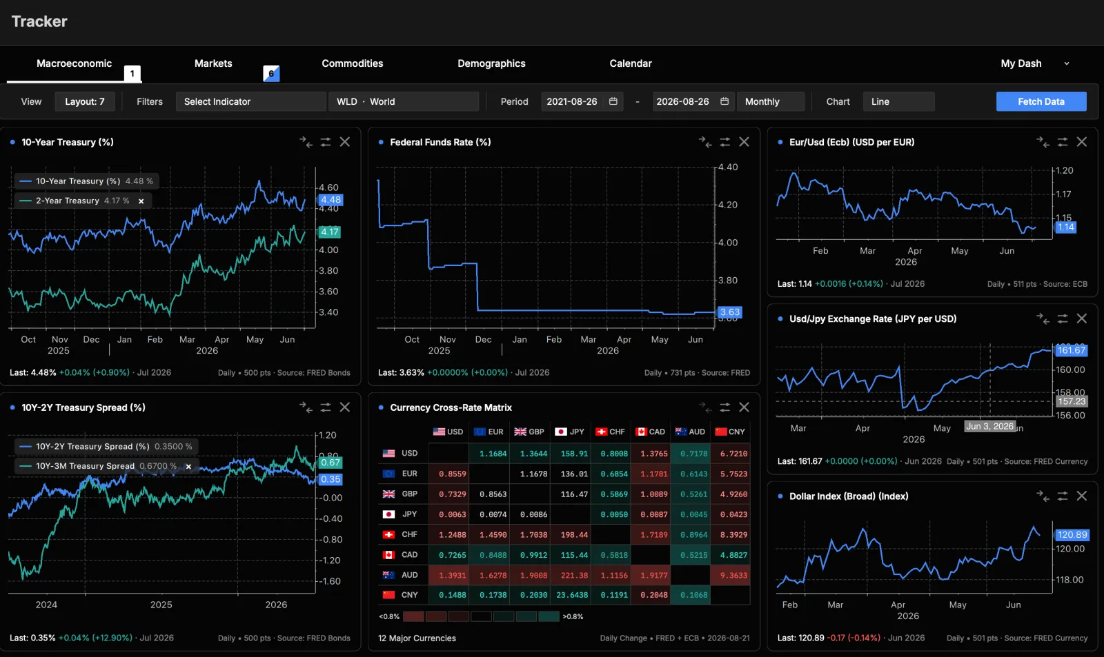
The Tracker plots macro, market, and environmental time series. You pick a data family, choose an indicator, filter it by country and date range, and draw a chart. You can also overlay several series to compare them.
Data families
Tabs across the top switch between families:
- Macroeconomic Growth, inflation, employment, interest rates, trade.
- Markets Equity indices, bonds, and volatility.
- Commodities Energy, metals, and agricultural prices.
- Climate Temperature, precipitation, and vegetation, including map views.
- Demographics Population, births, deaths, and migration.
- Calendar A schedule of economic data releases.
Each tab shows a badge with how many charts are currently plotting that family.
Choosing what to view
Below the tabs, a control bar adapts to the selected family:
- Indicator: pick from the family's list of series.
- Country / region: choose a country or region. This is disabled for global series such as commodities.
- Date range: set the start and end dates.
- Frequency: daily, weekly, monthly, quarterly, or annual. Only the frequencies available for your selection are shown.
- Chart type: line, area, or bar. Climate adds seasonal and map views.
- Fetch Data: load and draw the chart.
A few specialized views
- Currency Matrix (under Macroeconomic): a grid of currency cross-rates, color-coded by daily move.
- Climate maps: selected climate indicators can be shown as a 2D map or a rotatable 3D globe for a chosen month.
Continue to Charts & Comparisons for chart types, overlays, and export, or the Economic Calendar.