Financials
The Financials view shows a company's three core statements, the income statement, balance sheet, and cash flow, with controls for the period and scaling.
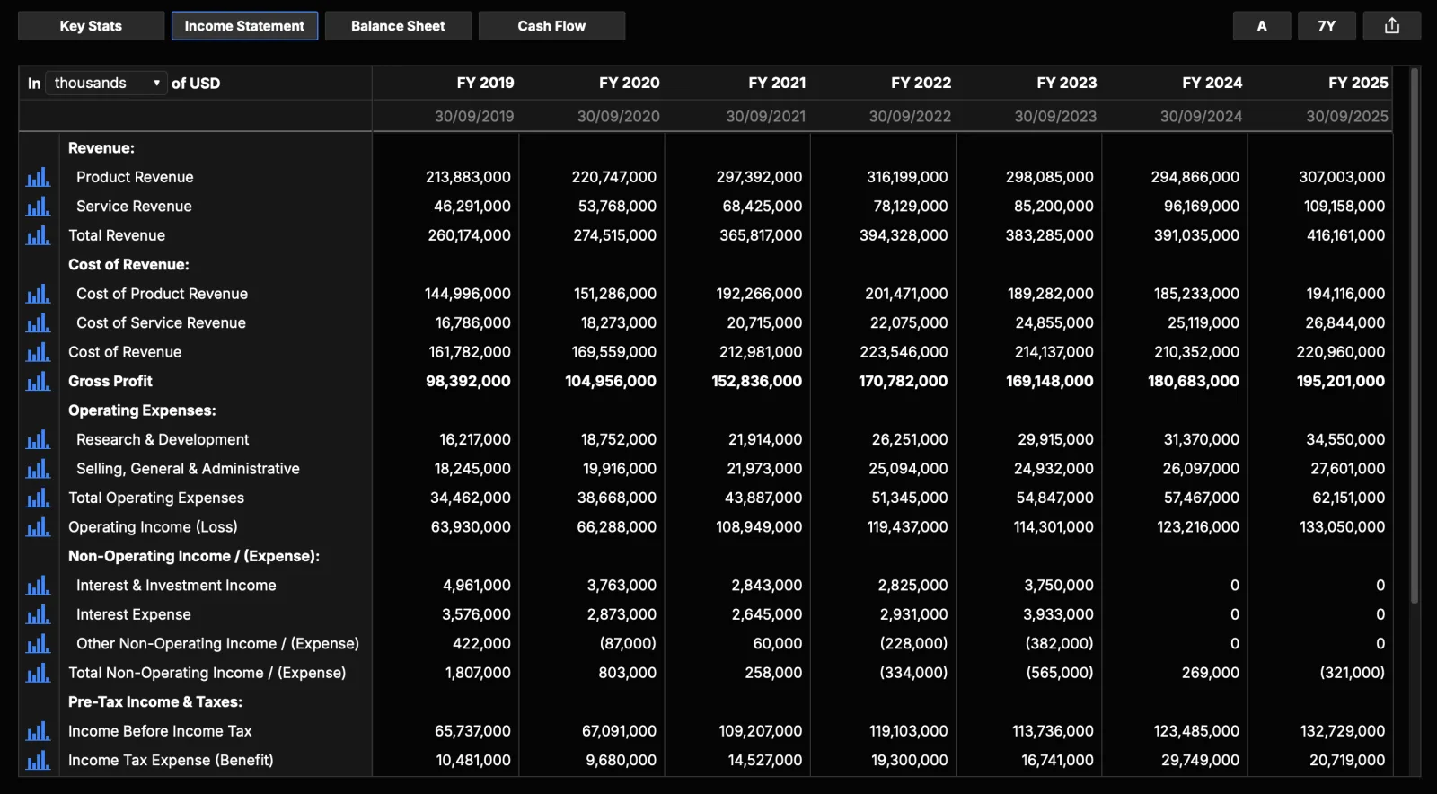
The three statements
- Income statement: how the company performed over a period, running from revenue at the top down through costs and expenses to net income at the bottom.
- Balance sheet: what the company owns and owes at a single point in time, showing assets, liabilities, and shareholders' equity.
- Cash flow: the actual cash that moved during a period, split into cash from operating, investing, and financing activities.
What you'll see
- A statement selector to switch between Key Stats, Income Statement, Balance Sheet, and Cash Flow. Key Stats gathers the headline figures (revenue, operating cash flow, capex, free cash flow, dividends, and so on) in one place.
- A data table with standardized line items down the side and time periods across the top (newest first).
- Figures use a consistent presentation, so companies are comparable.
Standardized line items
Companies do not report their statements in the same way. They use different labels for the same idea, group and split lines differently, and file under different rules depending on their jurisdiction. Standardized line items map each company's figures onto a common set of rows, so that revenue sits on the revenue row and long-term debt sits on the long-term debt row no matter how the original filing was worded.
This matters when you read one company against another. When the rows line up, you can compare a US filer against a foreign one, or this year's structure against a prior year's, without first untangling how each chose to present the same numbers. The values remain the company's own reported figures; standardization organizes them into a shared structure rather than changing what was reported.
What you can do
- Period: switch between Annual (the default) and Quarterly. Annual shows full-year figures from a company's annual report; Quarterly shows the shorter interim periods for a closer view of recent trends. In annual mode you can also add a TTM (trailing twelve months) column, summed from the last four quarters.
- Display periods: choose how many years or quarters to show, for example the last 5 years or a custom count.
- Scale: view figures in thousands (the default), millions, or raw units. This only changes how large numbers are displayed so they are easier to read; the underlying values do not change.
- Presentation: switch between Standardized and As Reported. Standardized maps each filer's lines onto a common structure; As Reported shows the filer's own presentation labels (available for database-backed filers).
- Row trend chart: click a line item's chart icon to plot that item over time, split-adjusted for per-share metrics.
- Export: download a single statement or all statements to Excel, or export the current table as PNG or PDF.
Clicking a cell to trace a figure back to its source filing is available as a beta feature; when enabled, it opens the underlying filing in a dedicated viewer window.
Note
Line items are standardized into a consistent structure, so that different companies and different jurisdictions line up for comparison.